Branding In A Time Of Covid
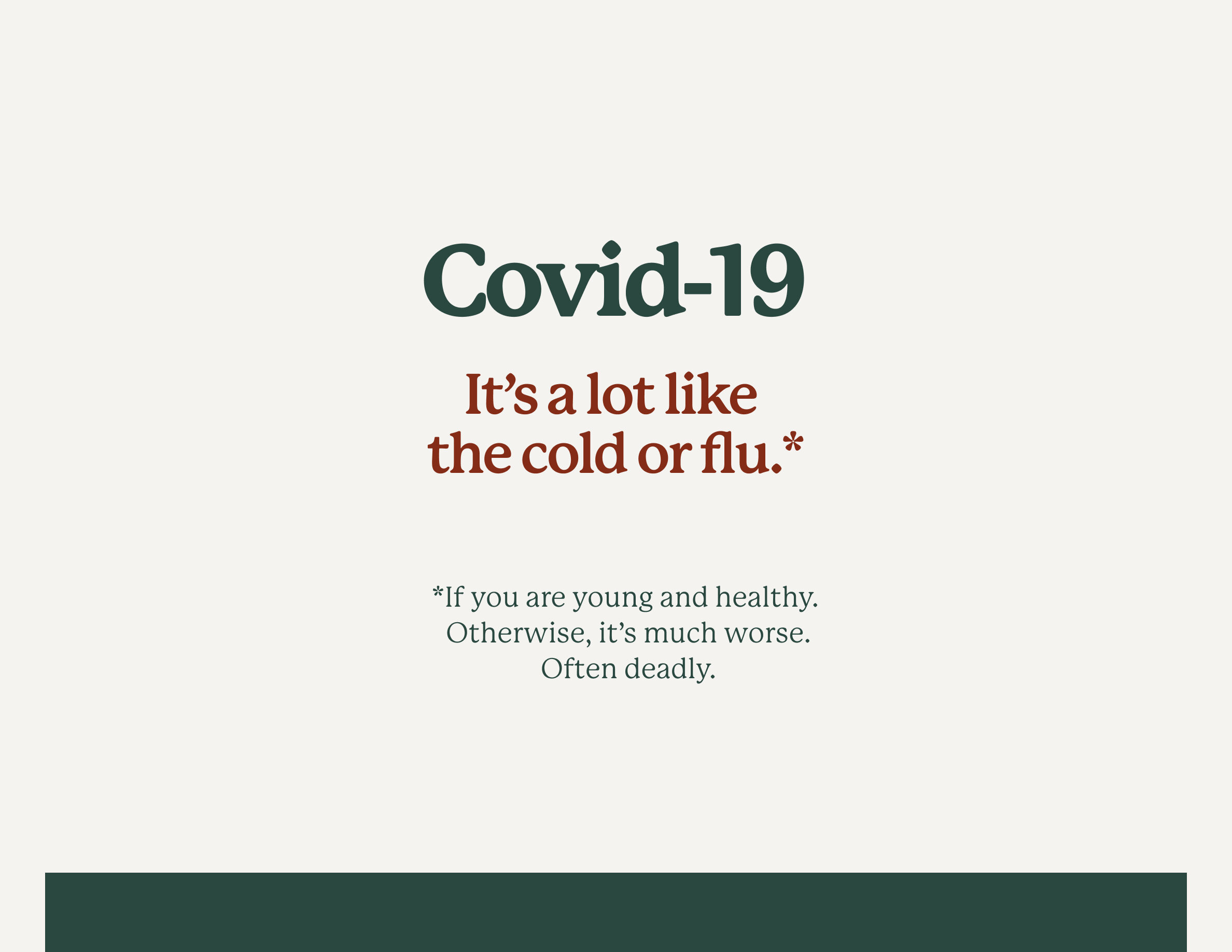
The visual identity for Covid-19 is pretty scary. It’s often a super-condensed sans-serif typeface, all caps, in blood red. I’m pretty sure the design team went to movie posters for Outbreak and Contagion for inspiration. As much as I don’t love the Millennialification of everything via branding, I was curious about what the Covid-19 identity would look like if it was more approachable like Chobani. It’s incredible how much a few colors and typefaces can change the presentation of an idea. I’m left almost as scared of branding as I am of Covid-19.
P.S. I know that’s not actually Chobani’s typeface. It’s P22 Mackinac from Adobe Fonts.
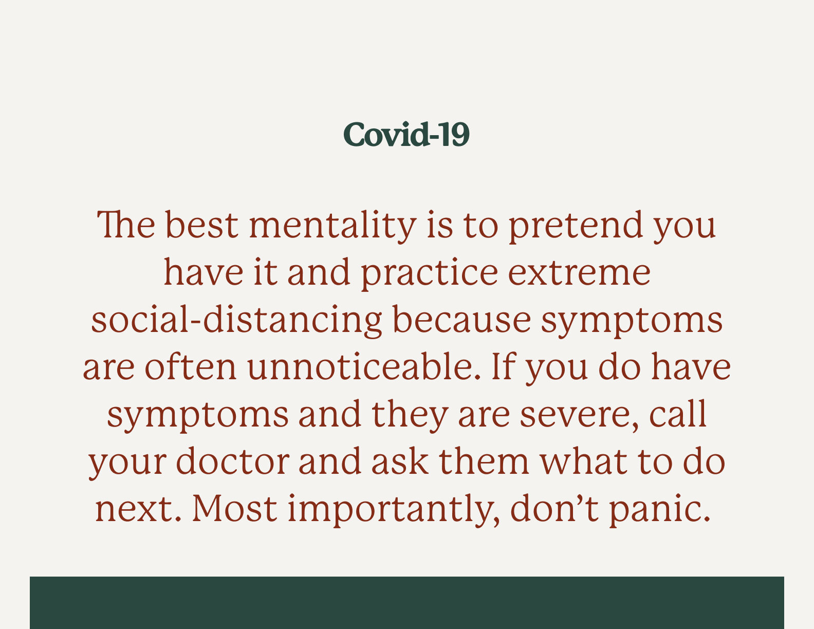
Update 03/16: I added the asterisk above because, without it, it felt a little like I wasn’t taking Covid-19 seriously. It is serious. Especially for older people. Meg and I are trying hard to have the mentality of “not passing” vs. “not getting.” Framing it that way helps us feel less selfish about staying at home all day, knowing we’re less of a threat to our older neighbors in case we do have it but are asymptomatic. When we do go outside, it’s for a walk, run, or groceries. If we do meet with people, it’s outdoors. We’ve been on the phone and video chats a lot, chatting with friends, family, and clients about the situation and other non-related subjects. It helps to talk.